Kosher Without Borders
Making Kosher travel easy…
Kosher Without Borders is a restaurant locator that helps travelers who follow a Kosher diet discover new and exciting places to eat while on vacation.
I increased the customer retention rate and product satisfaction by improving user journeys and adding game changing features.
Highlights
Customer satisfaction increased by 28%
Search times for Kosher restaurants got reduced by 95%
Users claimed they trusted the service more compared to the old experience
Situation
Users would download the app, use it once and then delete it almost immediately. Users were taking a long time to find Kosher restaurants and felt like they were wasting their time because the search page had irrelevant results thrown in the mix that didn’t match the filtering keywords.
User Interviews
User didn't have confidence in our product because it was difficult to use and the search showed irrelevant results. Users were taking an average of 3m 40s to find a Kosher restaurant.
They felt overwhelmed by the quantity of extra services offered and often became lost and frustrated trying to find what they were actually looking for.
Re-Branding
The original logos were too busy and they weren’t modern. One of them was very similar to a competitor’s. I aligned the re-branding to be minimalist in all areas.
KWB Logos
Competitor’s Logo
Color Mood Board
To align with KWB’s 18 to 35 year old audience the colors had to be bright and bold. I collected images associated with travel and extracted color palettes.
Logo Explorations
The selected logo had a gradient with dark and bright blues and a bold green which made the background look like an island surrounded by the ocean.
Cohesive Design Across Platforms
When creating the design system it was crucial to ensure consistency across the desktop and mobile experiences while adapting to each platform’s usability patterns.
Desktop Cards
Mobile Cards
Original Website
The original desktop website had accessibility issues, unfriendly search patterns and confusing information architecture. Users had a hard time understanding what the website was about and finding what they were looking for.
Over Crowded Homepage
Issues Highlights
Accessibility: text contrast didn’t pass accessibility guidelines.
Unintuitive Patterns: search bar and button confused users.
Information Architecture: lots of information fitted into the homepage that should be distributed into other pages like About Us and Destination Guides.
Website Redesign
The focus of the redesign was to include consistent branding, enhanced search functionality, and simplified information architecture.
The additional services KWB offers were featured on the homepage with a call to action to learn more so the main page wasn’t crowded.
Simplified Homepage
Feature Highlights
Navigation: simplified and easy to read.
Search & Filters: user friendly patterns and better affordances.
Location Based Recommendations: provides additional value for users that are on the go and need quick solutions.
Original Mobile Application
The mobile application had limited search functionality, it showed irrelevant results, and searching for Kosher restaurants in the map view was difficult.
Issues Highlights
Limited Search & Filters: search only accepted one keyword. Filters were unreliable.
Irrelevant Results: results would include restaurants that were closed down or that didn’t have a current Kosher certification. It also included travel guides for different places.
Mobile Application Redesign
The focus of the mobile application redesign was to make it easier for users to search and filter restaurants.
Providing more information about the restaurants on the cards and including several pictures of the food served was crucial to help users to quickly browse and decide if the restaurant was worth considering or not.
Feature Highlights
Location Based Search: travelers could find places to eat around them quicker.
Enhanced Filters: included sorting, and general and diet specific filters.
Relevant Card Metadata: added rating, reviews, average pricing, restaurant hours, and tags.
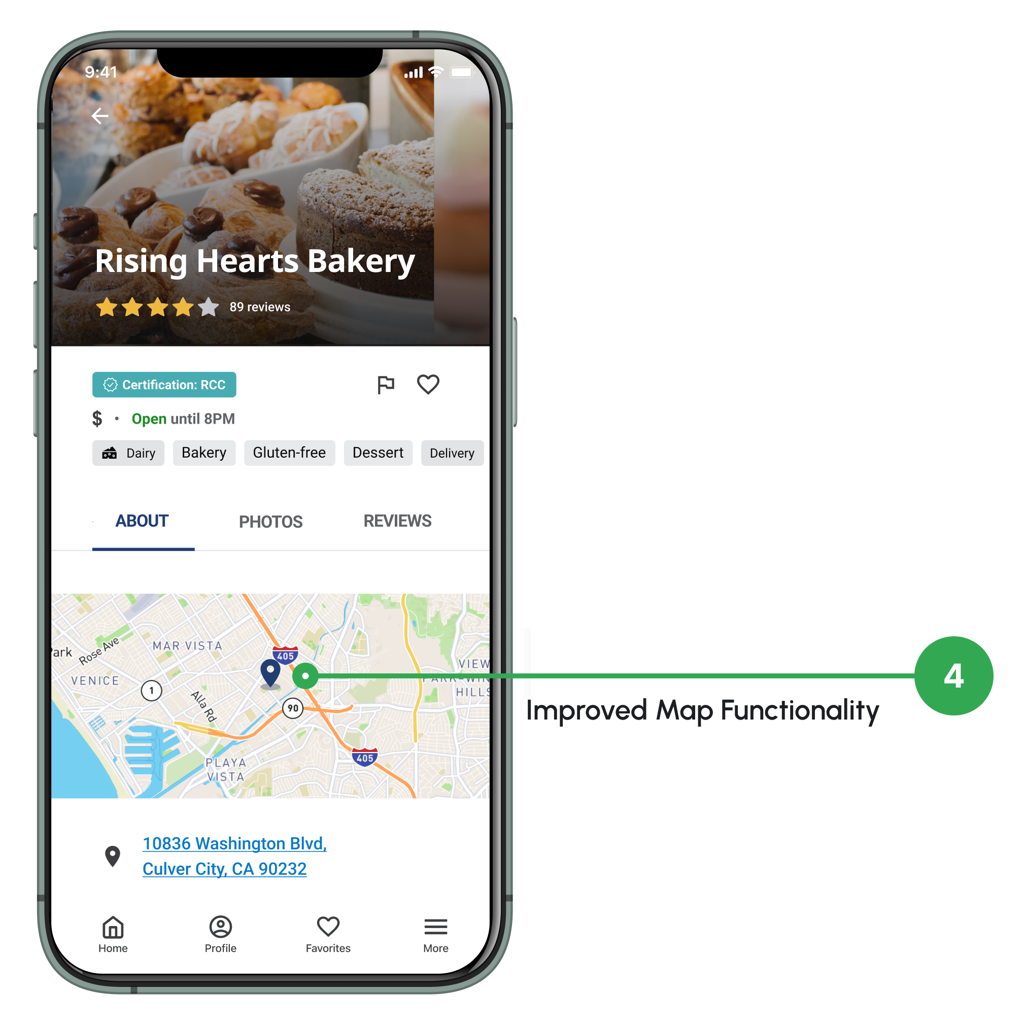
Improved Map Functionality: restaurant shows on the map and users can save the address to the clipboard or open it on their map application of choice.
Results
The time it took users to find a Kosher restaurant got reduced by 95%. It went down from 1 minute and 40 seconds to 31 seconds on average.
The overall customer satisfaction increased by 28%. The SUS survey score went from an F to a B grade.


